Image: Citroën
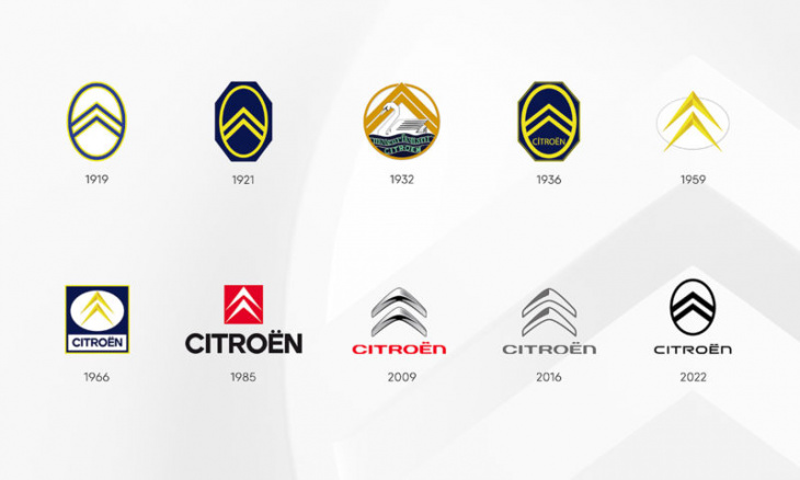
Image: Citroën
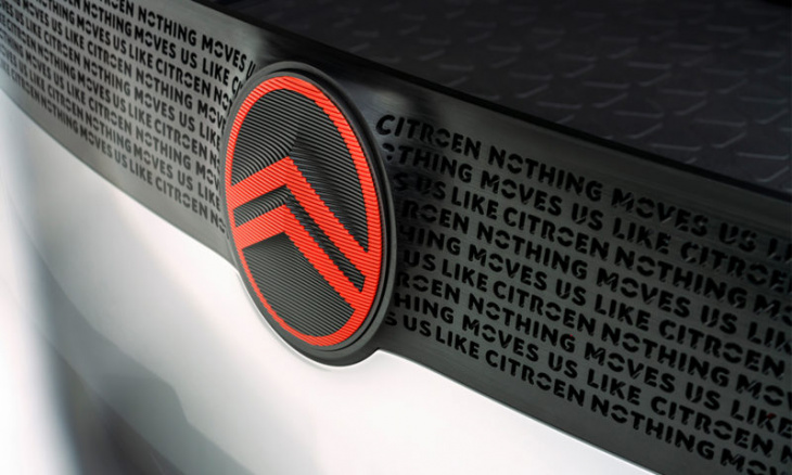
Image: Citroën
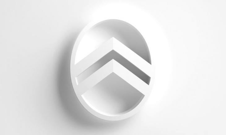
Image: Citroën
The double chevrons remain for the latest Citroën branding ahead of a new future of electrification. Here is what badging on the French products will look like from now on.

Image: Citroën
Not too long ago, fellow French automaker Peugeot underwent a rebranding which saw its lion logo evolve into what we see on their new products today. Now Citroën is doing the same as the latest iteration of their logo becomes the tenth in their impressive 103-year history. Have a look at how the logo evolved below.

Image: Citroën
The new Citroën branding retains the iconic double chevrons (“deux chevrons” in French”) although the new iteration of the design is an obvious evolution of the original logo adopted by André Citroën during the company’s inception in 1919.
The new Citroën branding will feature for the first time on a car the company tout as a “significant conceptual family vehicle,” and thereafter, every model to roll off of the production line will be adorned with the throwback Citroën branding – we can expect this all to unfold between Q2 and Q3 of 2023.
The upgraded branding will replace the existing derivative on dealership facades, merchandise and official documentation. Have a look at a creative video of the new Citroën branding taking many different forms in this video.
In addition to the new logo for the French brand will be the Monte Carlo Blue shade which can be specified as a body colour on models in the lineup. It will also become a central colour to the brand’s corporate identity alongside Infra-Red which will replace the current shade in corporate applications.
Citroën CEO Vincent Cobée went on to add that the new branding is an “elegant symbol of progress” on the road to a purely electric future so perhaps this updated identity will last more than 6 or 7 years as the previous two iterations have.
Keyword: Citroën branding gets updated for the tenth time in 103 years