The British company has also launched a new creative strategy that comes with a new brand expression: "Intensity. Driven."
Aston Martin revealed its plan for a new creative strategy Wednesday and with it, a newly revamped logo.
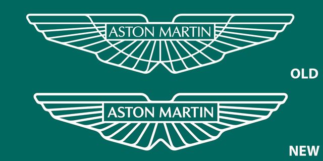
This is the eighth time in the British sports car maker’s 109-year history it has changed its logo, electing to retain the iconic wings design, first introduced in 1932. The updates are subtle but easy to spot: A deletion of the central line that swoops under the “Aston Martin” text and connects the two wings, and bolder lining across the board. Other than those two things, it’s exactly the same. If you see any other differences, let us know in the comments.
Along with the new logo comes a new brand expression: “Intensity. Driven.” According to a statement released by Aston Martin, the phrase “builds on Aston Martin’s strong, established reputation for combining luxurious craftsmanship and sophisticated design with high-octane emotion and intense driving pleasure, as defined by breath-taking new models such as DBX707, V12 Vantage and the uncompromising Aston Martin Valkyrie.”
The new design will make its first appearance on Aston’s Formula 1 cars at the French Grand Prix this weekend just in time for the 100th anniversary of the brand’s first Grand Prix entry. On the nose of each car will also sit Aston Martin’s original “button” logo as a neat throwback.
Keyword: Can You Spot The Differences Between Aston Martin's New and Old Logos?