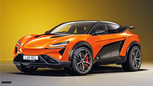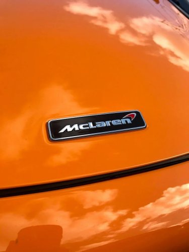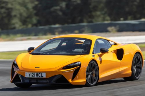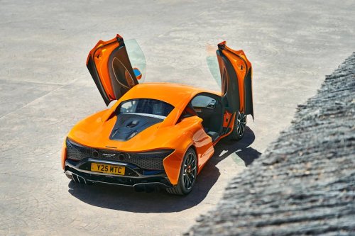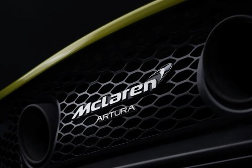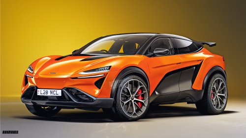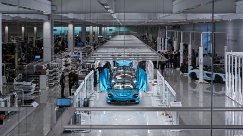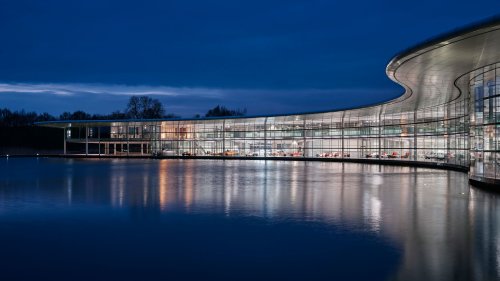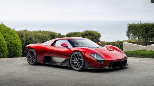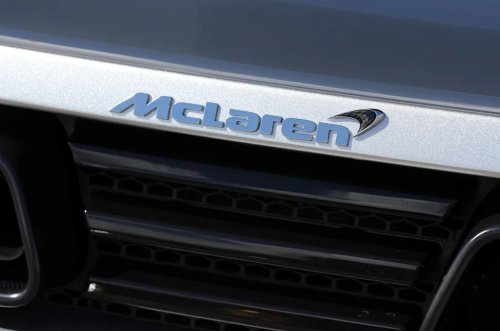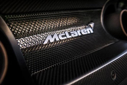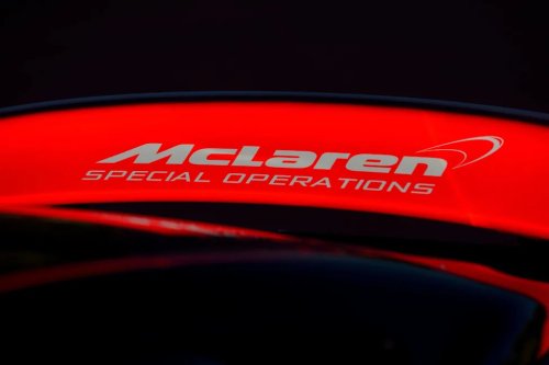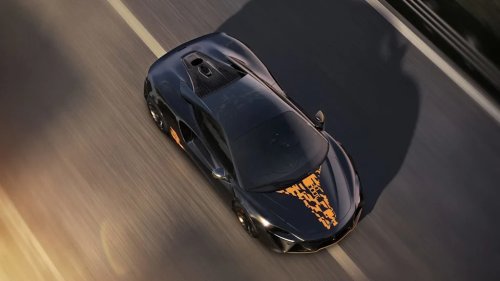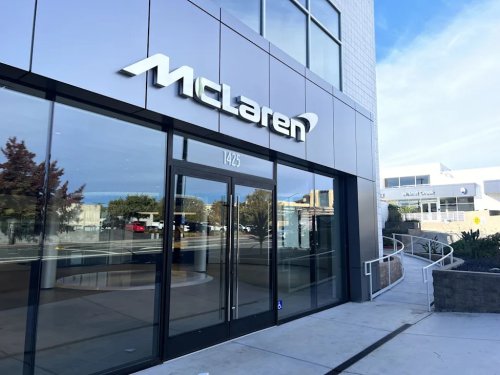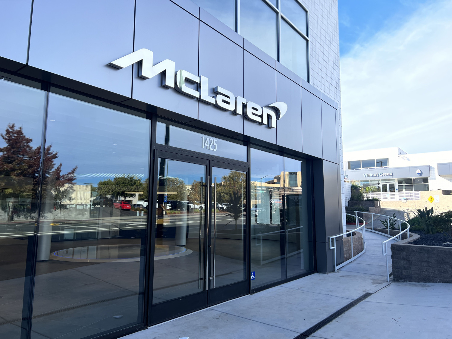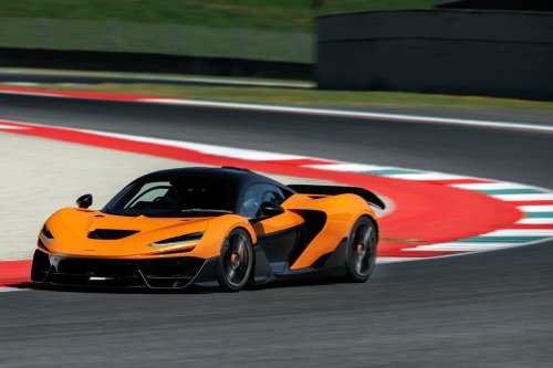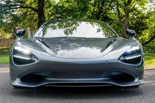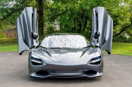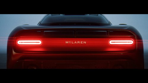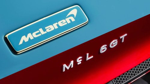
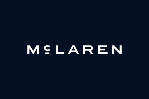

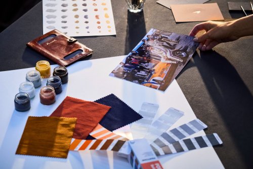
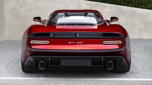
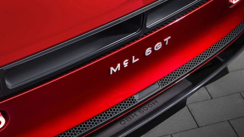
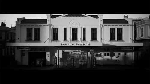
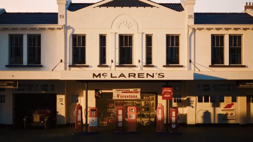

















McLaren unveils new branding inspired by Bruce McLaren’s workshop. The redesigned wordmark is joined by McLaren’s iconic speedmark. The new style has already debuted in the McL 6GT manual V8 supercar. McLaren is embarking on a new era, and is marking the transition with a fresh corporate identity. The company has revealed a streamlined new wordmark which is linked to its founder’s heritage and will be gradually rolled out across its future production vehicles, merchandise and digital material. The rebrand is inspired from the sign outside of the family-owned Service Station in Auckland, New Zealand, run by Bruce McLaren’s parents. This place played a pivotal role in developing the engineering passion of McLaren’s original founder, as this is where he modified a 1929 Austin Seven that carried him to his first-ever race and motorsport victory at Muriwai Beach. More: 10 Years Too Late, McLaren Confirms SUV Plans The wordmark is an evolution of the signage with a custom font called McLaren Sans. The highlight is the horizontal line under the letter C, and the fact that all letters are uppercase unlike the current logo which is mixed. Interestingly, the flagship McLaren W1 might be the last new model to feature the old logo on its nose. Furthermore, McLaren retains its iconic Speedmark logo and the Speedy Kiwi honoring its New Zealand roots. As for the updated color palette, it includes the signature Papaya (orange), alongside Ember (reddish orange), Midnight (blue), Black, Anthracite, Colnbrook (silver) and Mist (white) all sourced from a single photo of Bruce McLaren sitting on the tire of his single-seater. According to the supercar maker, the evolved brand identity “brings together the marque’s past, present and future in one connected expression across McLaren Automotive and McLaren Racing”. McLaren has also promised that its new era will bring “deeper personalization, richer experiences and an even stronger sense of community” amongst owners and fans. More: McLaren’s Next Supercar Will Pack A Bigger Punch Than The 750S For Less Money David Woodhouse, McLaren Automotive’s Chief Creative Officer, said: “There is something uniquely special about McLaren. Throughout our history, we’ve never been content to follow established paths. We’ve always looked ahead, driven by a restless desire to innovate, create and push beyond expectations. This evolution of our visual identity captures that spirit. It’s a reflection of the journey we are on as a company. It marks the beginning of a new chapter for McLaren, giving a physical expression to the ambition, creativity and forward momentum that is shaping our future.” McLaren While new branding debuted today, McLaren had given us a hint at the launch of the McL 6GT during the Monterey Car Week last August. The mid-engined supercar with a manual V8 configuration introduced a new design language inspired by the classic M6GT racecar and featured the new font between its taillights. As hinted at by the official video, the McL 6GT lettering has now been replaced by the full McLaren wordmark. More: McLaren Set To Say Sayonara To Artura In 2028 This branding refresh coincides with ambitious plans for the Woking-based automaker. McLaren recently announced intentions to build a second manufacturing facility in the UK and transition toward in-house engine production as part of a £500m ($668m) investment. As for the production lineup, it will expand to include front-engined models with two rows of seating, including McLaren’s first-ever SUV.