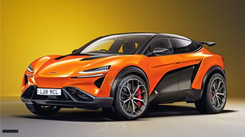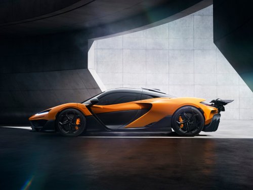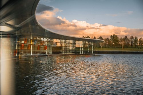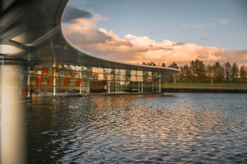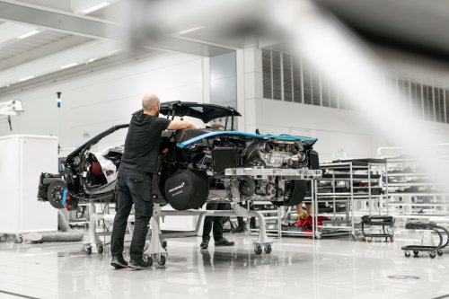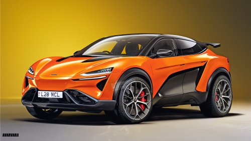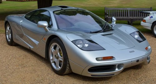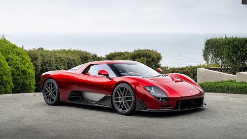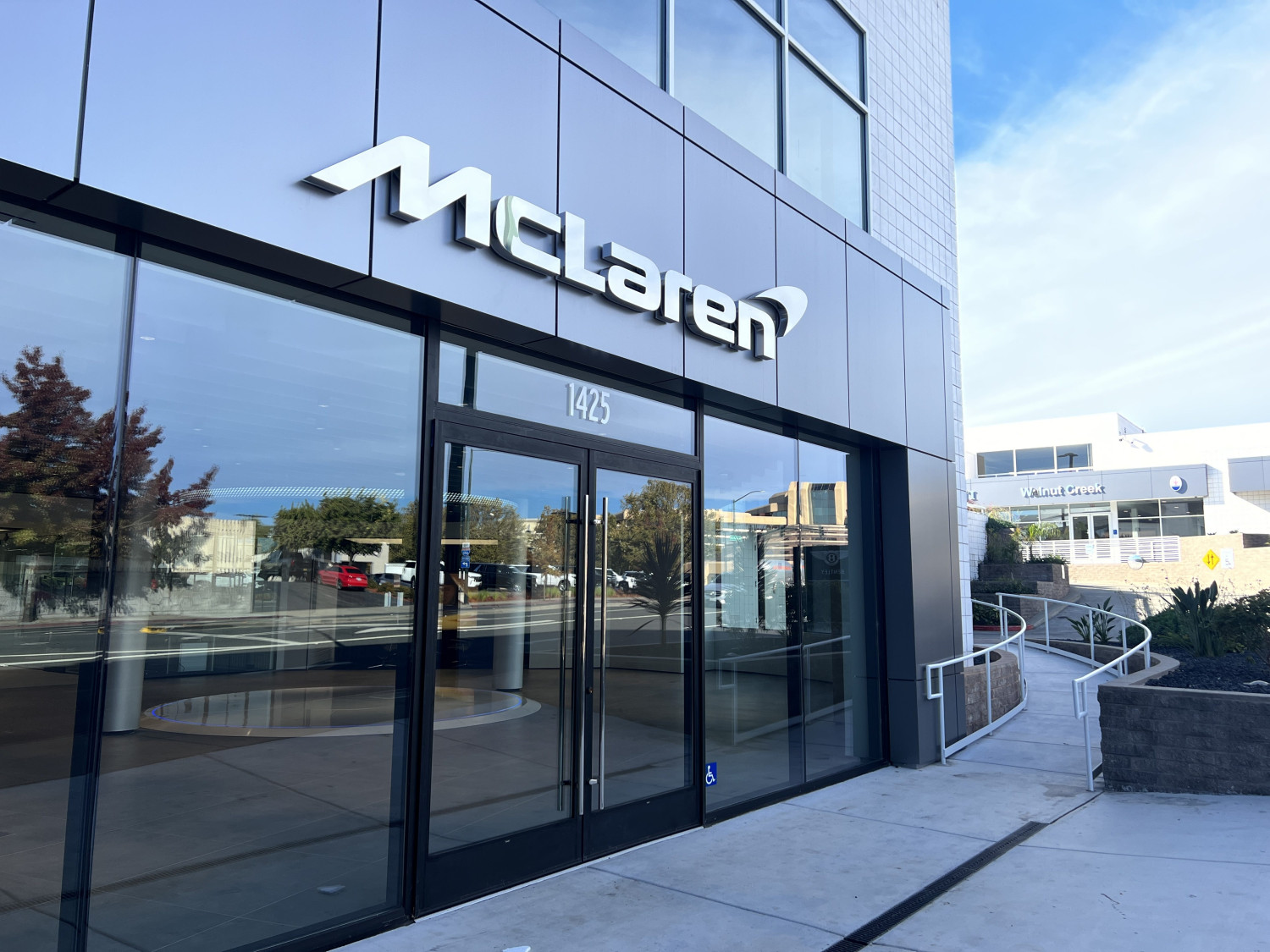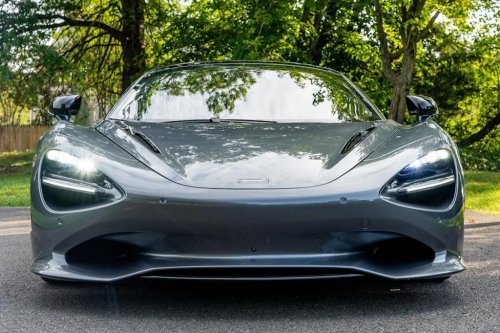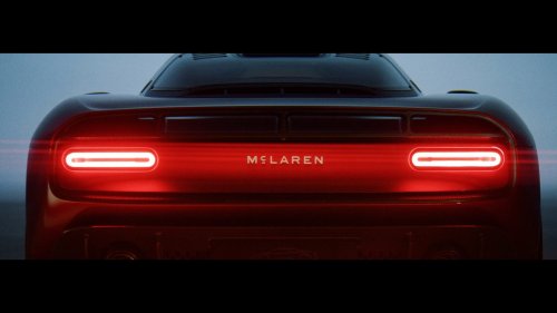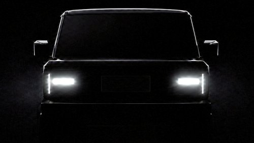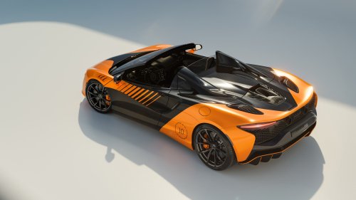
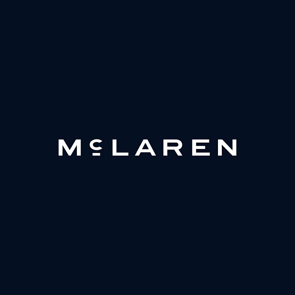
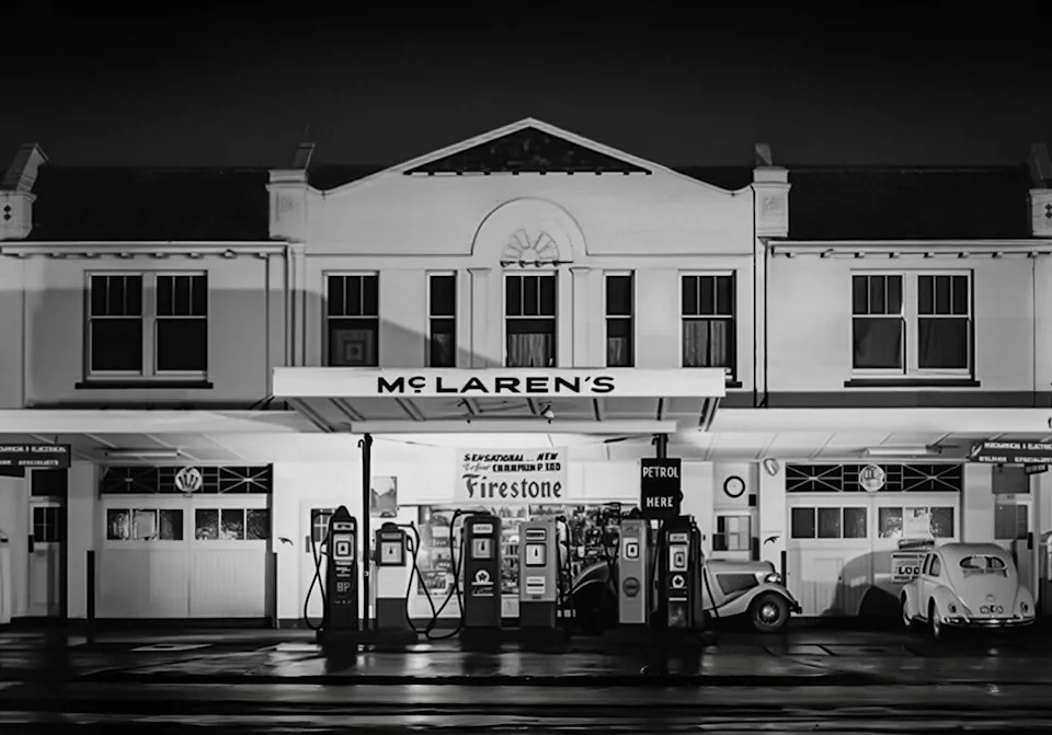

















McLaren's New Logo Has Its Roots in Bruce McLaren's Family Gas StationRoad & TrackJoe KucinskiTue, September 22, 2026 at 4:09 PM UTCAdd us on GoogleMcLaren's New Logo Has Deep RootsMcLarenIf you had any doubts that McLaren Automotive is entering a new era, just take a look at the major announcements that have surfaced over the last month or so. First came the debut of the stick-shift McLaren MCL-6GT at Monterey Car Week, after which came news of a more than $600 million investment in the McLaren Technology Centre in Woking, England. That was followed last week by confirmation that McLaren is developing its first-ever SUV. Now, with the company itself changing so much, McLaren has unveiled a new wordmark and visual identity designed to carry the brand into its next chapter.Somewhat ironically, McLaren looked backward to create their new identity. Before it was a Formula 1 powerhouse, or the name attached to what many consider the greatest hypercar ever made, it was simply a family name—one hand-painted above the service station owned by Bruce McLaren's parents in New Zealand. That was where a young Bruce began learning developing the mechanical curiosity that would eventually lead him into racing and car building, and McLaren says those original letter forms inspired its new wordmark.McLarenTo create its new identity, McLaren incorporated symbols and colors used throughout its history. That includes the McLaren Heritage Shield, created during the company's early days and rooted in Bruce's New Zealand heritage; the famous "Speedy Kiwi" also remains part of the story. More recent McLaren history hasn't been forgotten, either; the asymmetric Speedmark remains part of the identity, connecting the new design to the symbol that has appeared on McLaren road and race cars for years.AdvertisementAdvertisementEven the colors have stories behind them. Papaya is, naturally, front and center, tracing back to Bruce's decision to use the bright color to make his race cars easier to identify. Ember takes inspiration from racing suits of the period, while Midnight references a blue present during McLaren's earliest years. McLaren even developed a new typeface, appropriately called "McLaren Sans," using letter forms related to the new wordmark.We've seen a number of automaker rebrands over the last few years, with most designed to embrace a new future. McLaren is doing the same, but it hasn't left its storied history behind them; its new look is firmly rooted in where the company began.You Might Also LikeIf You Can Only Own One Car, Make It One of TheseThese Are the Most Popular Cars by State