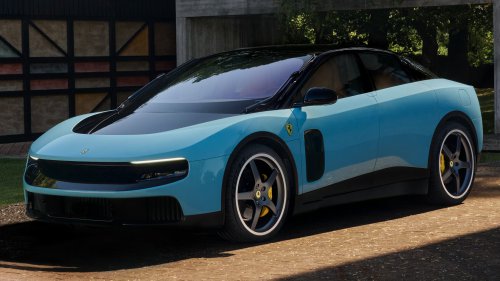
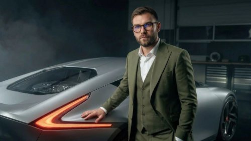
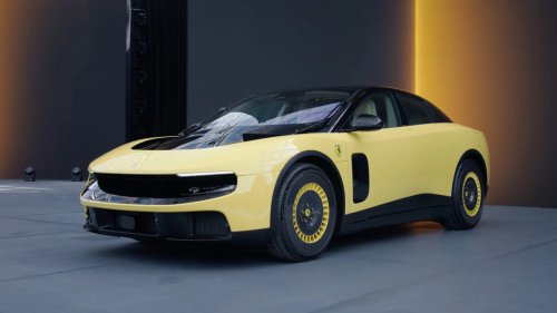
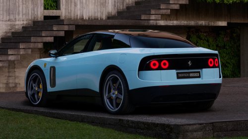
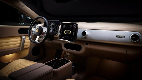
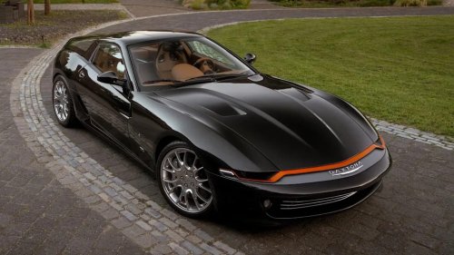
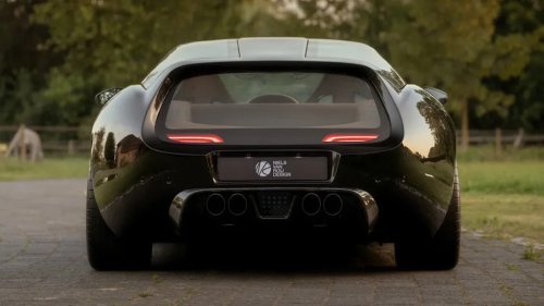
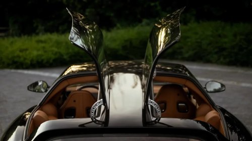
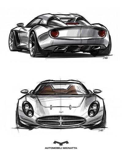
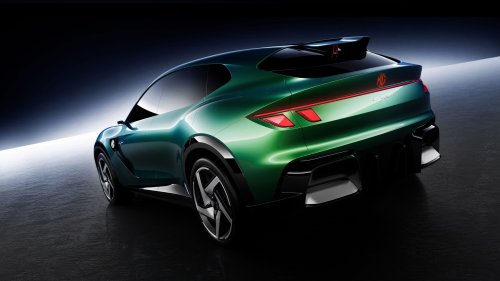
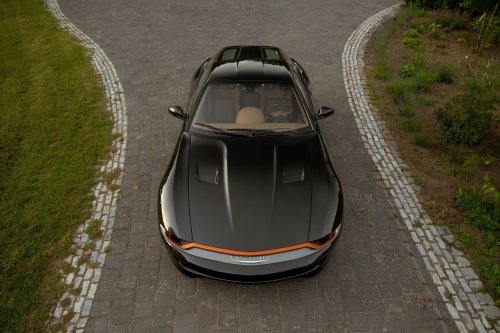
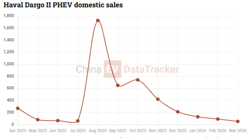
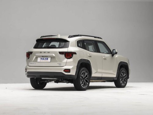
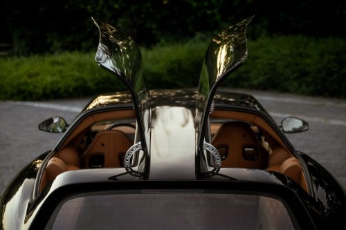
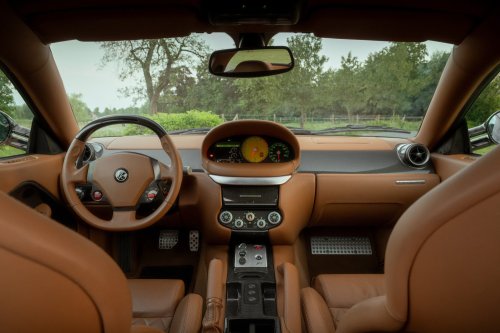
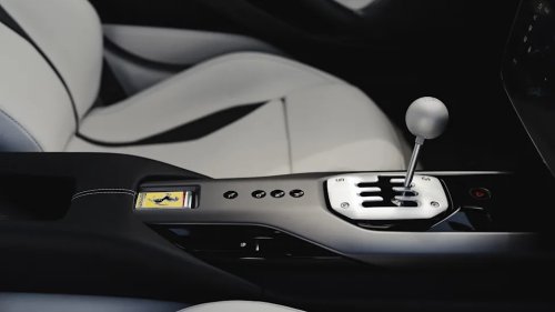
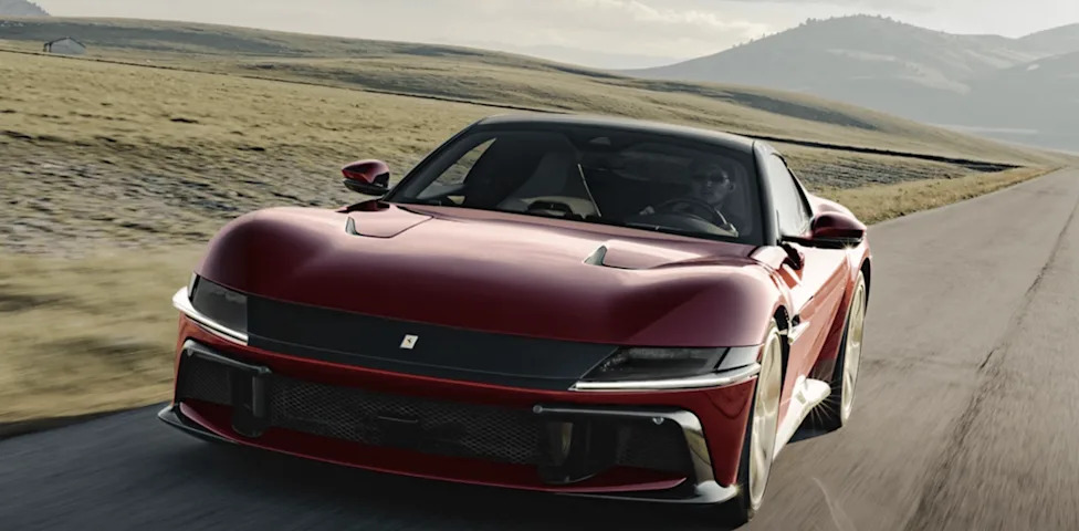
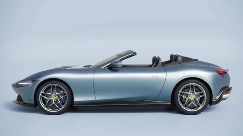
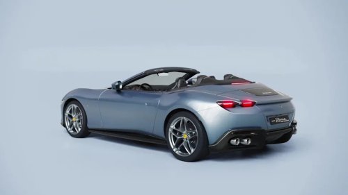
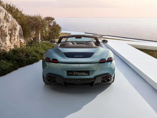
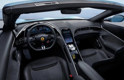
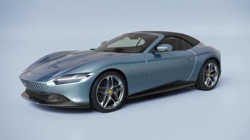
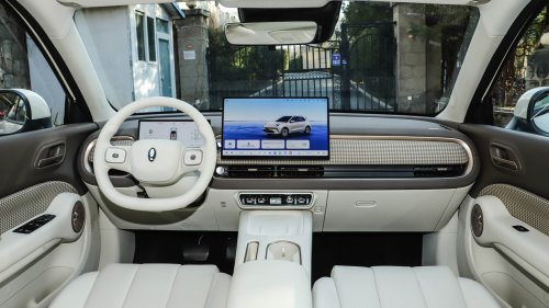
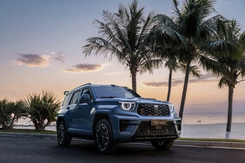
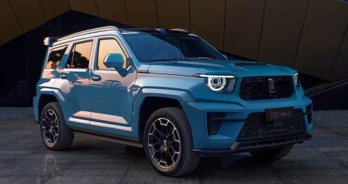
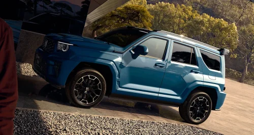
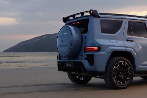
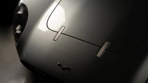
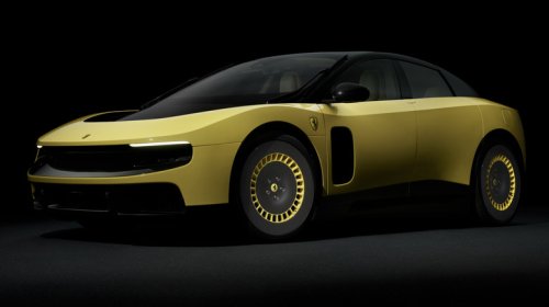
Ex-Nio and GWM designer explains why Ferrari Luce is a missed opportunity. Credit: Ferrari Understand China EV’s Market Real-time notifications when critical EV data is released All important data in one place 2,000,000+ data points Become a member Ex-Nio & GWM designer Alexey Semenov explained what’s wrong with the Ferrari Luce styling exclusively to CarNewsChina. Why does this car represent a missed opportunity? Alexey Semenov is a Munich-based automotive designer with extensive experience with brands such as Subaru, Fiat Professional, Nio, GWM, and Fisker. He participated in the design of the Fiat 500 Electric, the second-gen Nio ES6, the GWM Tank 700 concept car, the Fisker Ronin, and the Fisker Pier. Alexey currently runs his own design consultancy, A3 Agentur, which focuses on automotive, wheel, and product design, among other areas. Alexey Semenov CarNewsChina reached Alexey Semenov with a question about the contradictory design of the Ferrari Luce electric car. He sent us his professional design statement in response, revealing what is actually wrong with its styling. We decided to cite his commentary in full. Alexey Semenov’s design statement about Ferrari Luce The Ferrari Luce presents an interesting case study in the fundamental distinctions between industrial design and automotive design – two disciplines that, while related, operate under very different principles and constraints. Approached purely as a designed product, and setting aside the Ferrari brand for a moment, the Luce reveals the tensions that arise when these two worlds collide. In terms of exterior proportion, the vehicle reads as short, narrow, and tall – a challenging combination for automotive aesthetics, and one that makes the management of volumes particularly critical. Unfortunately, the volumetric treatment does not fully resolve these proportional tensions. The car carries a sense of visual compression that the design language struggles to overcome. Wheel design is one of the most controversial parts of the Luce’s styling Perhaps the most puzzling decision concerns the wheel design. For a vehicle specified with 23-inch front and 24-inch rear wheels – an exceptionally bold technical choice – the visual outcome is counterintuitive. The aero wheels with a colour split, in particular, are a significant missed opportunity. Rather than anchoring and stretching the car’s stance, the wheels read as visually undersized relative to the body mass. This is a well-understood challenge in automotive design: wheel visual weight must be calibrated to the body’s perceived mass, not simply to its mechanical dimensions. The colour split employed on these wheels actively diminishes their perceived diameter, creating the impression of a much smaller wheel – 14 to 15 inches in size. The rear end of the Luce is a difficult visual mass The front end is the exterior’s most resolved area, projecting a degree of confidence and purpose that partially holds the composition together. The rear, however, does not carry that confidence forward. It reads as wide, high, and compressed – a difficult visual mass that the transition from the roofline fails to elegantly conclude. The reinterpretation of Ferrari’s classic four-circle rear light graphic, while well-intentioned as a heritage gesture, does not integrate convincingly into this new design language – the rear mass reads as abruptly terminated rather than resolved, leaving the composition without a satisfying conclusion. More broadly, the exterior surface treatment is conservative, considered, but ultimately cautious. The product design approach that informed the Luce’s development holds genuine potential for automotive expression, and one could argue that precedents such as the Testarossa – a car where industrial thinking and automotive drama were synthesised masterfully – offered a rich seam of inspiration. That potential feels totally unexplored here. The attention to exterior detail and the willingness to pursue the logic of the product design approach to its full expressive conclusion would have elevated the result considerably. Right now, it is neither one thing nor the other. The interior logic doesn’t share the design ambition The interior is a genuinely different story and deserves recognition as such. It is a confident, coherent, and beautifully resolved example of product design applied to an automotive environment — rich in considered mechanical detail, tactile quality, and a clear design philosophy carried through consistently. Executed with evident care, it would be entirely at home in a premium urban EV from an emerging brand. As the interior of a Ferrari at this price point, however, it raises an uncomfortable question about brand identity that the design does not answer. And this is precisely where the central tension of the Luce lies. The interior logic and the exterior language do not share the same design ambition or resolution. The former demonstrates what is possible when the product design approach is pursued with full commitment; the latter suggests that commitment was not equally applied. For a vehicle at this price point, and above all bearing this name, that inconsistency is difficult to overlook. The Luce is not without merit, and the intention behind its direction is understandable. But the distance between its potential and its execution – particularly on the exterior – represents a missed opportunity that, in the context of Ferrari’s design legacy, is the most honest conclusion one can draw.