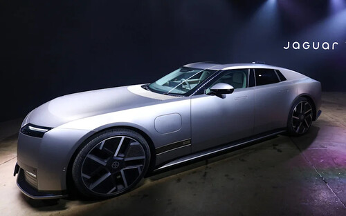
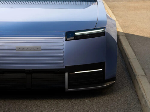
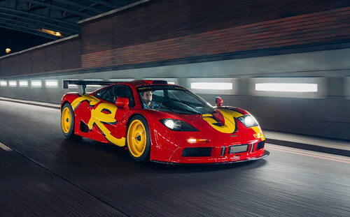
McLaren Revealed a New Wordmark Today, and the Real Story Is an Org Chart From AugustBackfire NewsJohn LloydWed, September 23, 2026 at 4:15 PM UTCAdd us on GoogleMcLaren pulled the cover off a new wordmark this morning, and if you've scrolled past the reveal on social media, you've probably seen the same jokes already: something about Marriott Bonvoy, something about Microsoft Word, something about the Jaguar rebrand. Fair enough — first reactions to typography are rarely charitable. But the wordmark itself is the least interesting part of what McLaren announced today. The interesting part is what it confirms about a management shuffle we flagged back in August, and the fact that it landed exactly where that org chart said it would.McLaren's official announcement, posted this morning across its Racing and Automotive channels, calls it an "evolved identity" rather than a rebrand, and that distinction actually matters mechanically. What changed is the wordmark, the typography spelling out McLAREN, recrafted with tighter letterforms and a script-style lowercase "c" that nods directly at the signage above the family service station in Remuera, Auckland, where Bruce McLaren's parents, Les and Ruth, ran their business, and where Bruce built the car that won him his first race. What didn't change is arguably more important. The Speedmark, the arrow-shaped symbol that has sat on every McLaren road and race car for decades, stays exactly where it is. Papaya, the brand's signature color, stays too, joined by what McLaren describes as an expanded palette pulled from specific moments in the team's history. The Speedy Kiwi, a small nod to Bruce McLaren's nationality that has followed the brand since his racing days, also survives. Applied across both McLaren Automotive and McLaren Racing, meaning F1, IndyCar and WEC all get the same new typography, this is a wordmark update, not a symbol change. That distinction is worth being precise about, because "logo" and "wordmark" get used interchangeably by people who don't design brand identities for a living, and McLaren clearly does not consider what it did today the same thing as, say, changing the Speedmark itself.Photo: McLarenWhich brings us to the part nobody covering this today seems to be connecting. In August, McLaren Automotive hired David Woodhouse as its first Chief Creative Officer, and we wrote at the time that his job description was the interesting part of that announcement, not his résumé. His remit covered brand identity, communications, retail environments, partnerships and licensed products, a mandate that sat awkwardly next to Kemal Curic, hired four months earlier as Chief Design Officer with responsibility for the design vision of McLaren's vehicle portfolio. We asked then how those two jobs wouldn't collide. Today's wordmark comes with Woodhouse's name attached in McLaren's own release, quoted as Chief Creative Officer explaining the thinking behind it. It's the first public output anyone can point to from that new structure, and it landed precisely where our reporting expected the changes to start: brand identity first, not sheet metal.AdvertisementAdvertisementThere's a mechanical reason for that sequencing, and it's the same reason a wordmark can ship eight months after a creative chief is hired while an actual redesigned car cannot. Exterior surfacing on a low-volume supercar typically gets locked two to three years before production, because tooling, aerodynamic validation and crash structure all key off that geometry once it's frozen. A wordmark, a color palette and a set of brand guidelines are decisions a company can remake in months, because none of them require re-cutting a stamping die. What you're looking at today is the fast half of Woodhouse's job. The slow half, a McLaren road car that visibly carries his fingerprints, is still years out, and given how often McLaren has rotated its design leadership lately, there's no guarantee it will still be his fingerprints on it when it finally arrives.The timing also isn't random once you line up what McLaren has put out in the last five days. On September 17, the automaker confirmed a roughly £500 million UK investment covering a new vehicle assembly facility, expanded operations in South Yorkshire, and, for the first time in the brand's history, engines designed and built entirely in-house rather than assembled by longtime partner Ricardo. On September 21, a dealer presentation reported by Automotive News put numbers on what that money is actually building: an approximately 810-horsepower hybrid V6 supercar, a front-engined 2+2 grand tourer, and a performance SUV sized to compete with a Porsche Cayenne Turbo GT. Today, September 22, the visual identity meant to hold all of that together under one recognizable brand showed up. Three announcements, three consecutive weeks, one company. That's not a coincidence. That's a rollout.The heritage angle is real, even if it's the part every other outlet covering this led with instead of burying it like we just did. Bruce McLaren's parents' service station is a specific, documented place, and McLaren's design team says it pulled the new script directly from the signage that hung above it. It's a more grounded piece of brand storytelling than most manufacturer rebrand copy, if only because Bruce McLaren's grave and his family's legacy in Auckland have made news for the opposite reason in recent years. A company willing to spend real money memorializing its founder's origin story in typography is making a specific bet about what still sells the brand: not just Formula 1 podiums, but the fact that a kid from New Zealand built a race-winning car in his parents' garage.Photo: McLarenContext for the timing: McLaren Racing is having its best stretch in a generation. The team is coming off a championship-winning 2025 campaign that delivered both the drivers' and constructors' titles, its 1000th Grand Prix start falls this year, and it has already confirmed a Hypercar entry for the World Endurance Championship in pursuit of the Triple Crown. Brands don't usually touch their visual identity when things are going badly; they touch it when they've got a growth story to tell and want one unified look to hang it on. McLaren has both right now, a winning race team and a genuine product expansion, which is a better moment to spend money on typography than, say, three years ago.AdvertisementAdvertisementNone of this changes anything about the McLaren already sitting in your garage. Wordmark updates are forward-facing: new marketing, new dealer signage, new digital touchpoints, and eventually new cars once current model cycles turn over. Nothing about a 750S, an Artura or a 765LT gets retroactively rebadged, and the Speedmark on the nose of every one of those cars isn't going anywhere. That restraint is actually the bigger story if you zoom out to the industry level. Automakers touching a logo generally pick one of two playbooks: evolve it, keeping the symbol fans recognize while updating the typography around it, or blow the whole thing up and start over, the way Jaguar did in 2024 with a wordmark-only identity that dropped its leaping cat entirely and drew months of public mockery before a single new car had even been shown. McLaren chose the first playbook. Keeping the Speedmark while updating the wordmark around it is a lower-risk, lower-cost move than a full teardown, and it's consistent with a brand trying to fund a genuinely expensive product roadmap without also picking a fight with the people who already buy its cars.The wordmark itself will stop being news within a week. What's actually worth watching is whether Woodhouse's remit holds together once it collides with a design department that already has a Chief Design Officer, a vehicle lineup expanding into categories McLaren has never sold in, and a parent company that has said outright it expects the licensing and retail side of the business to grow. A new typeface is easy. Keeping four different product categories looking like the same company for the next three years is the actual job, and today was just the first receipt.