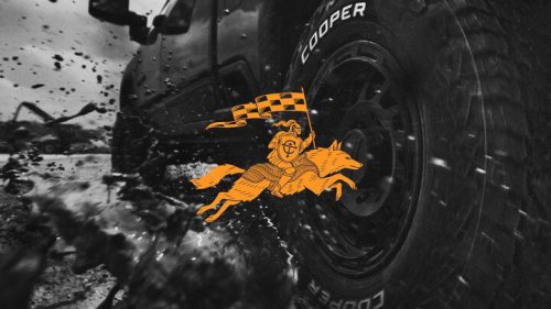
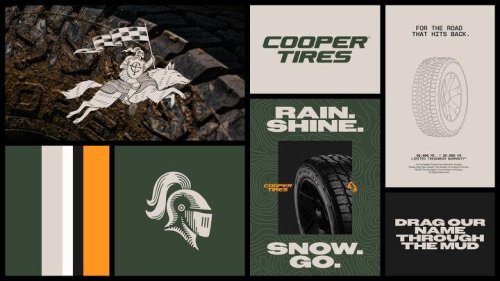
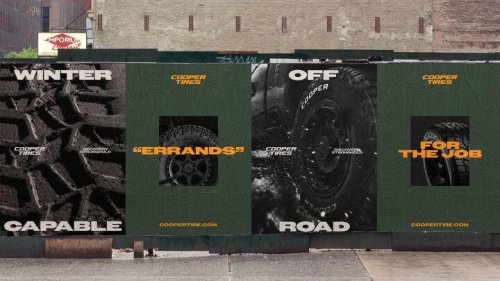
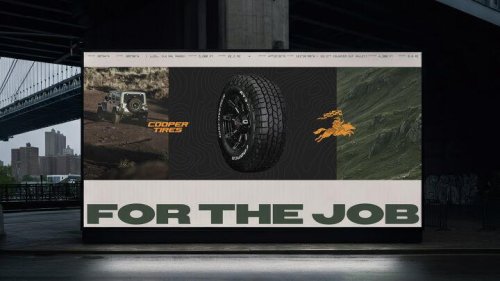
cooper tires gets a new look inspired by the past Cooper Tires is giving itself a bit of a visual reset. The company has introduced a new global brand look aimed at making it easier to recognize, whether you're scrolling online or standing in a tire shop comparing options. The update leans on Cooper's long history but tweaks how that story is presented. The logo, colors, and overall design language have all been refreshed with a more modern feel, while still holding onto familiar elements. 2026 Ford F-150 Raptor: All the Details cooper tires gets a new look inspired by the past One of those returning elements is the knight's helmet, which dates back to the brand's early days. It originally referenced the company's "Armored Cord" tires from the 1940s, and now it's been reworked into a cleaner, sharper version for today. There's also a new addition: an American grey wolf. The idea here is to reflect traits like adaptability and resilience-qualities the brand associates with both its products and the people who use them. The Ohio connection doesn't hurt either, since that's where Cooper was founded. cooper tires gets a new look inspired by the past The color palette has been adjusted as well. A deep green-called Valor Green-takes a central role, paired with an orange accent pulled from Cooper's earlier branding. Together, they're meant to stand out a bit more while still feeling connected to the company's past. Other updates include changes to typography, photography, and illustration style. The work was developed with Publicis P1T Crew, with creative led by BBH USA. You'll start seeing these changes roll out globally beginning in March 2026, showing up across Cooper's website, social media channels, and in advertising in select markets. This article was co-written using AI and was then heavily edited and optimized by our editorial team. cooper tires gets a new look inspired by the past Gran Turismo 7 January Update: All the Details